MySpark Business
B2B, B2C Self Service Portal

Product Design | E2E Journey | UX Design
2017-2019
Background
About the platform
MySpark Business is Spark NZ’s digital self-service platform used by businesses of all sizes—from SMEs to enterprise and government customers. It enables them to manage products, place orders, make service changes, and more.
The challenge
When I joined, the portal was outdated and not aligned with Spark’s new brand or experience principles. Customers faced friction across key journeys: form-heavy interactions, unclear navigation, broken flows, and a dated UI. These issues led to lower engagement and high support call volumes.
My Role
As the sole UX designer for MySpark Business, I was responsible for designing a comprehensive end-to-end (E2E) experience across the portal. This involved:
Leading the discovery and design process, from research to delivery
Aligning stakeholders across teams, including product, sales, and engineering
Developing wireframes, prototypes, and design documentation
Mentoring junior designers when needed
Ensuring smooth handoffs to development through detailed design specifications and ongoing collaboration
Discovery & Research
Uncovering What’s Broken and What Users Really Need
Pain Points Observed
Forms were long, unintuitive, and inconsistent across products
Users had to go through Spark staff to do basic admin tasks
Navigation was fragmented, with essential pages buried in deep menus
Government and managed customers needed custom flows that didn’t exist
I conducted:
Workshops with business stakeholders, SMEs, account managers, and call centre teams
Heuristic reviews of the platform
User interviews with external business customers
Analysis of help requests and logged service tickets
From this, I created current-state journey maps and identified key friction points across onboarding, account management, and support workflows.
The Design Process

Major Feature Redesigns
I led the design of multiple business-critical journeys:
Buy & change journeys for internet, voice, and managed services
Organisation & user management, including multi-user roles and delegation flows
Custom product views for government clients, who had unique requirements
Micro-portals: Modular React-based front-ends for areas like mobile management and billing were embedded into the legacy site for a phased rollout
Low-Hanging Fruit (Quick Wins)
I started with small, high-impact changes that could improve the experience quickly without needing backend overhauls:
Navigation refresh: Cleaned up the main menu structure and added consistent wayfinding
UI uplift: Introduced Spark’s new design language—spacing, typography, iconography—creating visual continuity with other Spark products
Form streamlining: Simplified fields and introduced conditional logic to reduce clutter

Creating Self-Service Capabilities
The portal originally only looked like self-service, but every form submission went to Spark staff. I redesigned key workflows to allow real-time changes:
Reset passwords
Add/remove users
Submit moves/adds/changes
View usage and billing


The Wall & Visual Artefacts
To guide decisions and bring everyone on the same page, I created a “Design Wall” with:
End-to-end journey maps
Clickable flows
Problem/opportunity boards
Annotated wireframes
I used Spark’s JUCCI framework (Journey, User, Capability, Channel, Initiative) to structure this work. This became a go-to space for developers, stakeholders, and testers to understand the customer vision and ensure alignment.

The wall
I've started an ambitious wall to build a display of artefacts, using Spark Digital's JUCCI framework as a guide. At the top, I listed the identified customer needs, followed by the core journey steps underneath, and then mapped out the key points to consider. After that, I placed detailed user flows and mapped the existing screens.

How the wall helped me
I worked closely with various teams including sales and marketing, product and pricing, billing, network engineers, provisioning, and logistics. These teams had not previously collaborated with an Experience Designer.
I found that displaying journey maps, user flows, and other visuals on the floor was incredibly helpful. People passing by would stop and look at the wall, leading to conversations about different aspects of the product, journeys, and solutions. I was always available to answer questions, share ideas, and post them on the wall, which gave me incredible insights and led to some great conversations.
Workshops
I planned and facilitated multiple workshops throughout my time working on the project for various needs, including UCDC workshops, Current and future state Journey Mapping Sessions, and collaboration sessions with architects and development teams

Journey mapping workshop

UCDC Session with Provisioning team

Journey map session CMN

User Centered Design Canvases
I've used UCDC as a discovery tool to thoroughly identify user needs and business requirements. By collaborating with stakeholders, we pinpointed who the users are, what they need, and what solutions we can bring.

Storyboards
Based on the situation and problem I need to solve, I usually create multiple artefacts to communicate with the stakeholders. Storyboard is my go-to tool to communicate ideas effectively to the team

Userflows
I always map out user paths to understand the different ways users interact with a product. I use tools like Draw.io, Lucidchart, Figma, and Miro to create visual representations of user flows, gaining a deeper understanding of user paths and system processes.

Journeymaps
Depending on how much we know about the journey, I've used various methods to create current-state and future-state journey maps. These maps provide detailed insights into the customer's experience, highlighting frictions, pain points, and emotions. This understanding allows us to improve and optimize the user experience effectively.
Testing, Iteration & Handover
Spark’s UX Lab: Conducted in-person testing with SME customers
Remote testing: For early feedback from regional business clients
Iterated based on task success, click tracking, and qualitative feedback
Final prototypes were handed off to developers via Zeplin with annotations, edge case notes, and accessibility guidance
Outcome & Impact
What Changed
Navigation clarity improved dramatically, with major flows moved to prominent positions
Time on task reduced significantly for core journeys like user setup and product changes
SUS (System Usability Scale) scores improved to 80+ for tested journeys
Micro-portals allowed Spark to progressively modernise parts of the platform without needing a full rebuild
Value Delivered
Empowered business customers to be self-sufficient
Reduced load on call centre and support staff
Created consistency across the B2C and B2B experiences
Unlocked flexibility to extend journeys for different customer types (e.g. SME vs Govt)
Portal improvements
Login and user management
Change password
Buy journeys - Product and services
Add product journeys
Change journeys - Product and services
Cancel product journeys
Change ownership journeys
Service request - Self-service
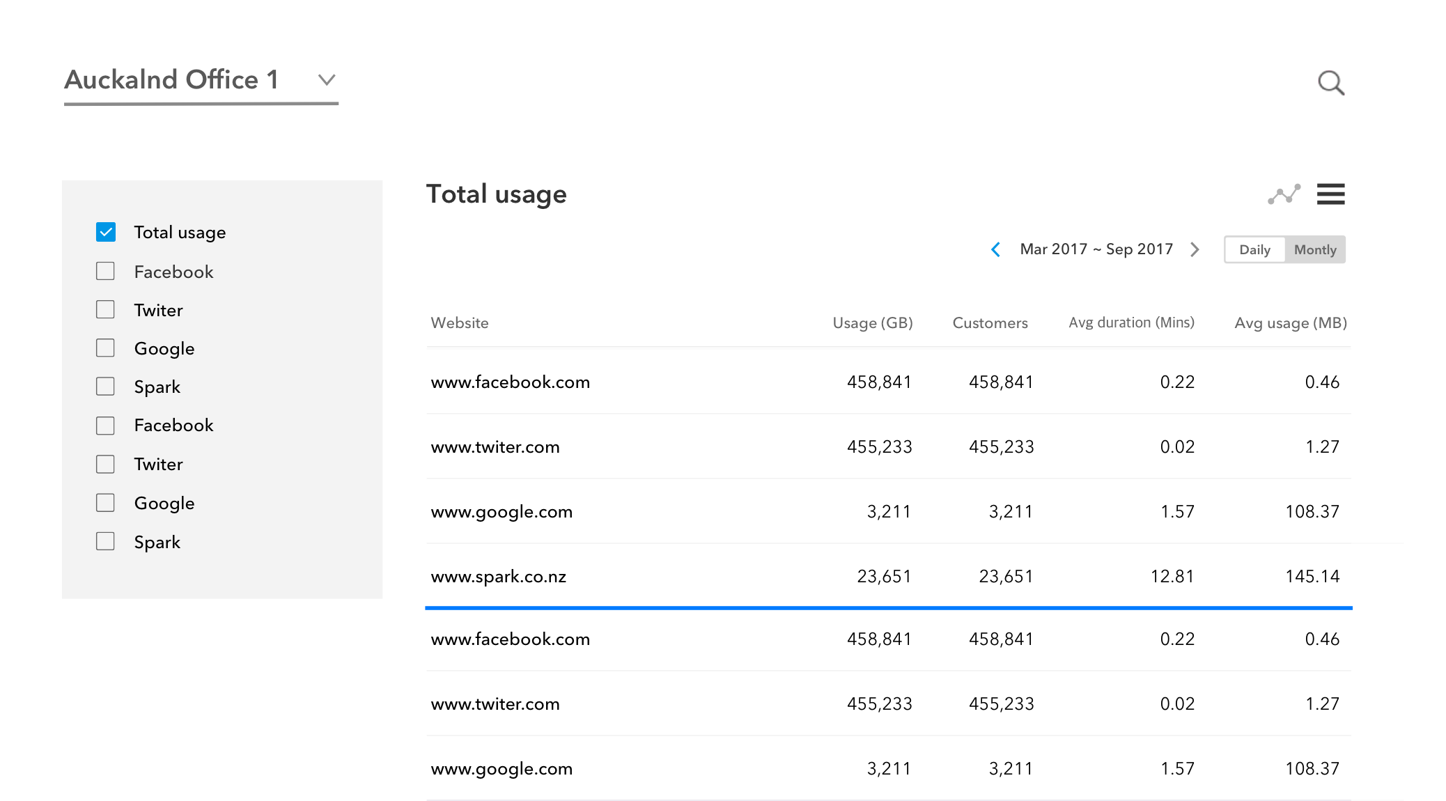
Billing
Micro portals (design finished)
Managed data Self-service portal
MAAS Service (Mobile as service)
CMN portal (Cloud-managed network portal)
PAPN -Order portal
ADS Queue for Staff
Portal for Government customers
Recognition
Winner – Best Team Player Award, Spark Experience Chapter
Recognised for cross-team collaboration, customer-first thinking, and delivering results on a constrained legacy stack
Leadership praised the visual wall and journey artefacts as a benchmark for future product discovery
What I Learned
Stakeholder alignment is design work: Visual artefacts (journey maps, walls, storyboards) are powerful tools that create shared understanding and drive action
Don’t wait for perfect tech: We unlocked value by working with constraints, not against them—layering modern UX onto legacy systems
Self-service is a mindset shift: We weren’t just designing screens—we were changing how businesses interacted with Spark