Designing for Trust and Compliance
Westpac NZ’s Depositor Compensation Scheme (DCS)
2023-25
Research | UX | Journey map | User Testing
Context
In 2023, the Reserve Bank of New Zealand (RBNZ) introduced the Deposit Takers Act (DTA), which mandated the implementation of the Depositor Compensation Scheme (DCS) — a regulation designed to protect eligible depositors and enhance trust in New Zealand’s financial system. At Westpac New Zealand, this regulation posed both a challenge and an opportunity: how could we ensure compliance while creating a customer experience that didn’t overwhelm or alienate users during potentially stressful situations?
As the Senior UX Designer leading this initiative, I was responsible for shaping the user experience across digital channels — both public-facing (website and app) and internal tools for bankers. My goal was to ensure clarity, empathy, and trust in every interaction, while aligning with Westpac’s refreshed brand identity and improving key metrics like NPS.
Challenge
The DCS required deposit takers to provide clear, accessible compensation information, presenting several challenges:
Complex Regulations: Customers needed simple explanations of eligibility and processes to avoid confusion.
Diverse User Needs: Users ranged from low-balance depositors to complex clients with over $100,000, each with unique concerns
Banker Efficiency: Staff required tools to guide customers effectively during inquiries.
Goals and Objectives
The project aimed to:
Ensure compliance with DCS regulations.
Build customer confidence in New Zealand’s financial system.
Simplify access to compensation information for users and bankers.
Improve Net Promoter Score (NPS) and banker experience.
Process and methods
I led a team of three (content designer, researcher), collaborating with product owners, developers, and compliance teams. My process was iterative, blending research, design, and testing to address user needs.

I supported,
30
Customer interviews
Supported and listened from 30 qualitative interviews (led by the Researcher) with customers aged 18–82, representing diverse deposit levels, with RBNZ observers.
I defined,
30 Personas
Created 30 anonymised customer profiles based on interviews and co-led a workshop with 30 participants to extract insights into user needs and emotions
2200
Survey participants
Co synthesised 2,200 survey responses from individual and business customers, revealing concerns like crisis preparedness.
6 Journeys
Defined 6 customer journeys (e.g., low-balance customers seeking information, crisis-affected users) using Westpac’s experience framework. Mapped needs across channels (e.g., website, app).

I analysed and identified impacted journeys
Using Westpac’s experience framework, I identified six key journeys that would be impacted by the new scheme — including low-balance customers seeking reassurance, dormant account holders reactivating for peace of mind, and even customers from other banks looking for reliable information.
These journeys formed the foundation for all subsequent design decisions

Critical Journeys
I narrow down the customer journeys to
existing customer with less than 100k balance seeking information
existing customer with more than 100k, labelled as complex customer
dormant customers reactivating accounts to be prepared
new to bank customers product origination
our bank customers in crisis
other bank customers in crisis…
Touchpoints
At Westpac, channels of engagement refer to the ways customers interact with the bank across digital platforms (Westpac One app, online banking), physical branches, contact centres, and third-party services.existing customer with less than 100k balance seeking information
Digital -un authenticated
Digital - Authenticated
Non Digital (branch, contact centre, Rms etc)
Define
Mapping needs and gaps
With clear journeys defined, I mapped user needs across channels and touchpoints, highlighting variations in behaviour depending on the context — for example, how a user might behave differently when opening a new term deposit compared to reviewing existing funds during a crisis. This mapping wasn’t static; I continuously iterated on it, layering in swimlanes for risk, emotion, and information delivery. It became a living artefact used throughout the programme to drive alignment.

Stakeholder alignment
At this stage, I recognised that many programme team members had limited exposure to UX practices. To build alignment, I focused on bringing them along the journey — explaining the design process, sharing artefacts, and demonstrating the value of user-centred thinking. By embedding UX into the programme culture, I helped shift the collective mindset from a compliance-first approach to a people-first perspective, ensuring all stakeholders were aligned around customer needs.

Define
Rapid Ideation and Prototyping
We moved into ideation with a series of co-creation workshops, including a Crazy 8s session with over 200 ideas generated. While not all ideas were immediately actionable, they surfaced critical considerations — from how to visually represent compensation coverage, to the emotional triggers tied to specific phrases.
Crazy 8

Viability & feasibility workshop
We held multiple workshops with various departments to assess the viability and feasibility of different solutions, along with expected costs, requirements, and priorities.

User Testing
Usability testing of key journeys
I created hypotheses based on the research and ideation, then designed a series of prototypes to test those hypotheses across customer and banker touchpoints. For example, I prototyped a dedicated DCS information section on the website and app, and an internal knowledge base update for bankers — ensuring both audiences had consistent, trustworthy content.
Hypotheses and script

Prototyped solutions

Tested with
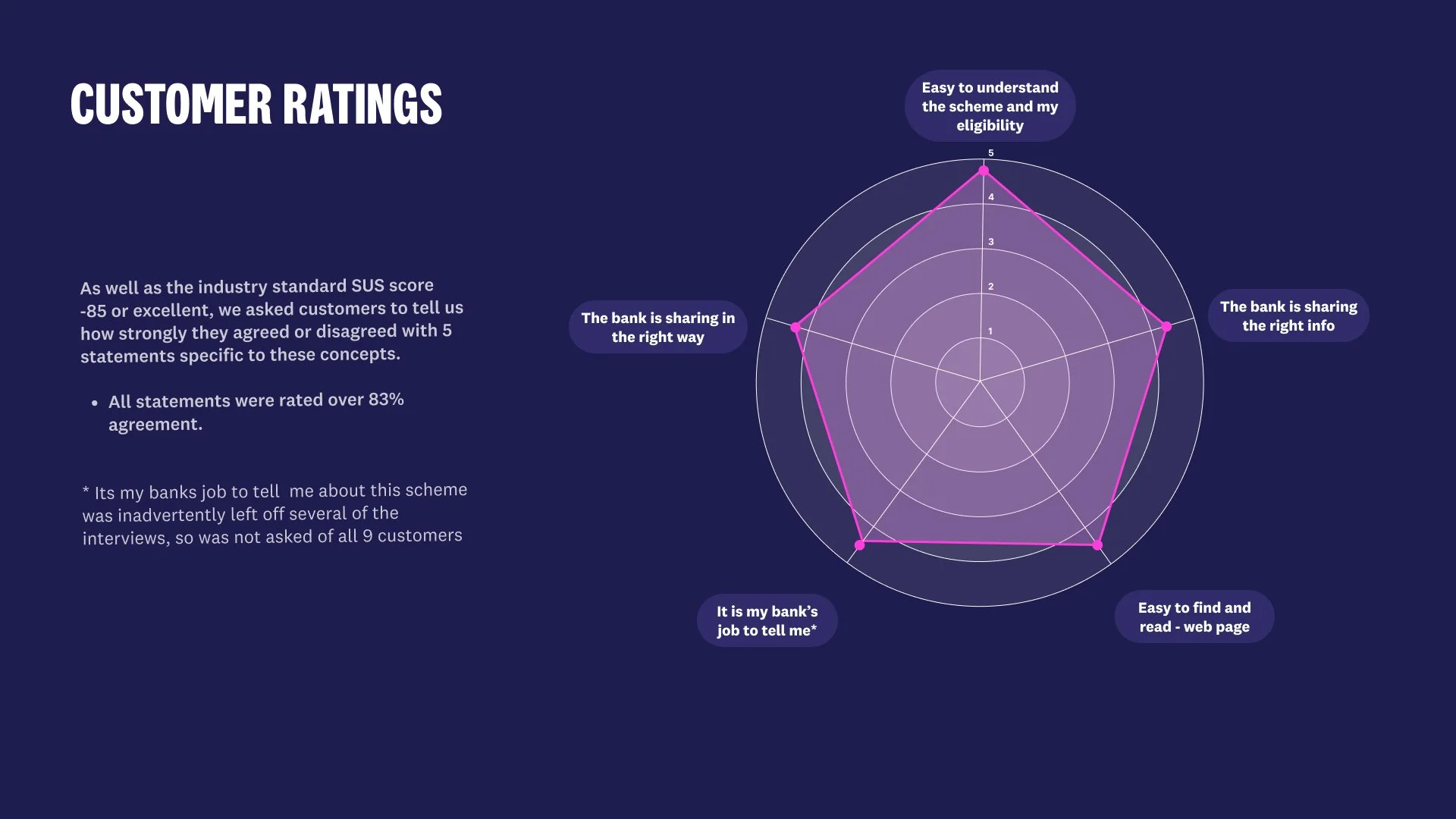
9 Customers
We needed to understand through user testing:
How easy the solution is for customers to use
Whether the bank is sharing information in the right way
If customers feel it is the bank’s role to provide this information
How easy it is to find and read the content
Whether the bank is sharing the right information
17 Staff
From the bank’s perspective, we also needed to understand:
How easily staff can use and explain the solution to customers
Whether the information is being communicated in the intended way
If staff believe it is the bank’s role to share this information
How easy it is for staff to locate, interpret, and use the content
Whether the information provided is accurate, relevant, and aligned with policy
Prepared a detailed report

Solutions
For customers and staff
For customers
we created a dedicated webpage with timely, plain-language communication that clearly outlined eligibility and product details. This ensured information was transparent, accessible, and directly tied to the products they already held with Westpac.
For staff
We updated the internal knowledge base with simplified content written in plain English. By testing the content strategy with staff, we helped boost their confidence and understanding, reducing the need for extensive training. The focus was on what the changes meant for them, and how to explain the customer impact clearly, so staff could better support customers with empathy and accuracy.


Socialising findings from testing
Testing showed that trust in deposits stems from clear, credible communication more than from the DCS itself. We recommended positioning DCS as reassurance, not promotion, supporting customers’ existing confidence in their bank.
During crises—such as bank instability or natural disasters—customers wanted reassurance, quick balance access, clear transfer processes, and realistic timeframes. Business customers were generally less emotionally engaged but still expected to be kept informed.
A key learning was around clarity of language: many said they didn’t understand the difference between advice and information—what they really needed was simple, factual guidance
Reflections
This project reinforced that compliance and empathy can coexist when there’s early alignment and clear communication between business and design.
Customers valued clarity and choice over prescriptive advice, reminding us that vulnerability can stem from many places — from financial insecurity to distrust in institutions. Good UX, therefore, isn’t just about simplifying screens; it’s about building confidence and simplifying lives.
Big Wins
Reduced operational costs by revealing customers needed clearer information, not another contact channel.
Shifted investment towards digital self-service, improving the website and knowledge base for long-term impact.
Empowered staff with plain-language tools to ensure confident, consistent customer support.
Strengthened trust through reassurance and transparency — giving customers “one less thing to worry about.”
Balanced compliance and clarity, embedding Reserve Bank policy without overwhelming customers in legal language.