Redesigning Westpac One

Design Strategy | Design System | iOs Android
2023
Westpac One, a leading online banking app in New Zealand, has been a cornerstone of digital banking for Westpac’s customers. In 2023, I led the UX strategy for its redesign to transition from a largely web-based platform to a fully native app, aligning with updated brand guidelines and modern user expectations. This project aimed to enhance the end-to-end customer journey, empower self-service across iOS, Android, and web, and address critical technical limitations.
Introduction
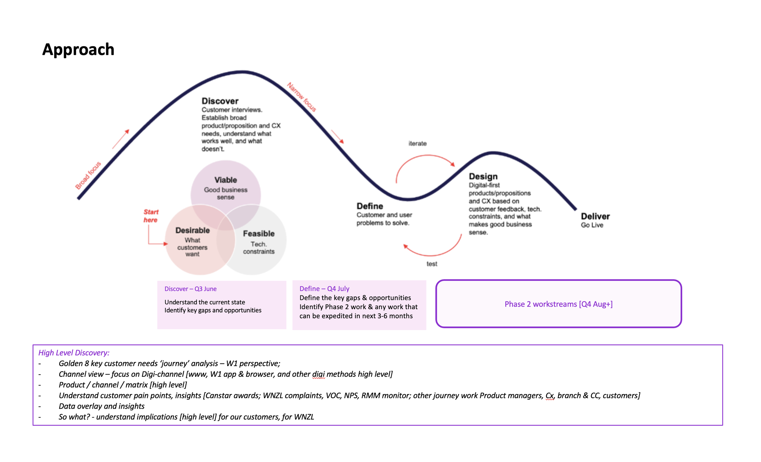
Problem and Context
Westpac One faced several challenges:
Outdated Architecture: The app was 80% web-based, leading to performance issues and a suboptimal user experience.
Unsupported Middleware: IBM’s MFS/MFB middleware, used to manage core app functions, was no longer supported, necessitating a rebuild.
Feature Gaps: Compared to competitors, the app lacked advanced features like budgeting tools and real-time notifications.
Brand Misalignment: Following the 2022 redesign of Westpac’s Australian app, Westpac One needed to adopt the updated brand identity.
These issues presented an opportunity to reimagine the app as a fully native, user-centric platform that would maintain Westpac’s digital leadership.
Business motivations
The redesign was driven by clear objectives:
Transition to a 100% native app for improved performance and user experience.
Replace IBM middleware to ensure long-term technical stability.
Introduce new features to match competitor offerings.
Align with Westpac’s refreshed brand, as exemplified by the Australian app.
My Role and Process
As a Senior UX Designer, I led a team of three, including a junior UX designer and a designer from the online business team. My responsibilities spanned research, information architecture (IA), prototyping, and user testing, ensuring alignment with stakeholder goals and user needs.
Process
I’ve planned and executed various activities to understand the pain points
Gap Analysis and Pain Points
Call Centre Data: Collaborated with a service designer to analyse call centre data, identifying common call reasons (e.g., payment issues, account access delays) and categorizing user pain points.
Competitor Research: Reviewed Canstar ratings and conducted iSky research to compare Westpac One’s features with competitors’ apps, identifying gaps like missing budgeting tools and slow transaction processing.
Internal Insights: Consulted internal researchers and reviewed feedback from other business units to gain a comprehensive view of user and operational challenges.
Prioritisation: Compiled findings and presented them to the tribe, facilitating sessions to prioritize high-impact issues (e.g., navigation complexity, lack of real-time alerts). Some challenges stemmed from technical constraints or prior strategic decisions, requiring broader organisational changes.
Hypotheses: Formulated hypotheses to guide the redesign, e.g., “Streamlining payment flows will reduce call centre queries by 20%.” These hypotheses shaped prototyping and testing.


Design principles
I established guiding principles to ensure a consistent, user-centric design:
To ensure a consistent, user-centric design, I led the development of guiding principles:
Inspiration: Reviewed Westpac’s Australian app and industry leaders like Spotify and Airbnb to understand how design principles shape user experiences.
Customer Feedback: Analysed in-app feedback, Power BI call centre data, and app store reviews to pinpoint pain points (e.g., complex navigation) and associated emotions (e.g., frustration).
Principle Development: Identified keywords (e.g., simplicity, trust) to address pain points, categorised issues, and drafted principles. Refined these through feedback sessions with the wider team to ensure alignment.
We created ours….

Information architecture
To lay a strong foundation, I analysed the app’s IA:
Current IA Analysis: Mapped the existing structure, identifying pain points like deep navigation layers that increased task completion time by 20%.
Benchmarking: Studied the Australian app’s flatter hierarchy, which improved account access efficiency.
Future IA Design: Conducted card sorting and tree tests with 30 users via Optimal Workshop. The new IA reduced navigation steps by 30%, with tree tests showing an 85% task success rate for key journeys like payments.
Current app IA

Australia App IA

Future IA
Led by another Designer

Conducted tree tests and card sorting activities with 30 participants, using optimal workshop, half of whom were customers, to analyze the current information architecture of the apps. Based on the feedback, we created a new information architecture and subsequently performed tree testing on the updated structure.
Aesthetic Direction
I led the aesthetic direction to localize Westpac’s recently redesigned branding strategy for the New Zealand market, ensuring a modern and cohesive visual experience:
Brand Localisation: Adapted Westpac’s updated brand guidelines, which introduced new colours, typography, and visual elements. Identified a localized colour palette (e.g., vibrant reds, calming blues) and sans-serif typography to suit New Zealand users while maintaining brand consistency.
Design System Updates: Updated the design system tokens to reflect the new colour scheme and typography. Tidied up libraries to align with the branding redesign, ensuring scalability across iOS and Android platforms.
Component Development: Updated existing components (e.g., buttons, modals) to comply with Material 3 guidelines for Android and Human Interface Guidelines (HIG) for iOS. Created new components to support features like budgeting tools, ensuring a consistent and modern user experience.
Collaboration: Presented style guides and component libraries to stakeholders and the XD team, iterating based on feedback to balance brand fidelity with platform-specific requirements.
Key journeys
Identified key journeys to test and improve, with our initial focus on the accounts feature.

Assumptions
Created assumptions based on all these pain points previous research and analysis

Prioritisation
Prioritied assumptions based on the map and identified which ones to validate first.

Hypothesises
Formed our hypothesise to validate
I created high-fidelity prototypes in Figma, focusing on key journeys like account management and payments. The prototypes incorporated the new IA, design principles, and art direction, addressing pain points and adhering to iOS and Android guidelines.
Prototype

Usertesting
I conducted 1-on-1 usability tests over Teams with 10 participants, who completed three payment scenarios while sharing feedback. Results confirmed hypotheses, such as reduced errors in payment flows, and validated the visual design’s clarity. Findings were shared with squads, tribes, and the wider Experience Design (XD) community.


Solution
The redesign delivered:
Streamlined IA: A flatter structure that reduced navigation complexity.
Native App Prototype: A Figma prototype showcasing key journeys, optimised for iOS and Android.
Design System: Reusable components aligned with Westpac’s brand for consistency.
Key journey: Proposed budgeting tools and real-time alerts to address user pain points and match competitors.
Impact and Results
The redesign achieved measurable improvements:
User Testing: Task success rates for payment scenarios increased from 65% to 90%, validating hypotheses around simplified flows and clear visuals.
UMUX Score: The native account journey achieved a Usability Metric for User Experience (UMUX) score of 85/100, up from 70/100.
Call Centre Impact: Early feedback suggested a potential 15% reduction in payment-related queries, pending full rollout.
Stakeholder Feedback: The streamlined IA and cohesive art direction were projected to reduce development time by 40%.
Business Alignment: The redesign positioned Westpac One as a modern, competitive platform, enhancing customer satisfaction and technical stability for New Zealand users.
My key learnings…
This project deepened my expertise in:
Collaboration: Aligned diverse stakeholders, from call centre teams to designers, on a unified vision.
Native App Design: Mastered iOS and Android guidelines for platform-specific UX.
Art Direction: Balanced brand identity with user-centric aesthetics to create engaging experiences.
Adaptability: Navigated technical and strategic constraints with resilience.
These insights will guide my approach to future UX challenges, ensuring user-centred and technically sound solutions.