Broadband e2e Experience
Simplifying broadband Selfservice journey for personal and business customers
Project Details
Domain: Telecom
Role: Senior Experience Designer
Duration: 3+ months
Team & Stakeholders: CX, UX, Product Owners, Engineering, Call Centre.
In 2019, Spark aimed to boost broadband sales through its digital channels. The company had recently updated its product propositions and plan names, shifting focus towards wireless broadband to increase revenue. The overarching goal was to revolutionise the online broadband journey, enhance sales, and streamline the house-moving process, ultimately reducing call centre volumes by promoting a self-service approach
Problem Statement
The existing broadband buying experience was underperforming:
Customers abandoned the process due to its complexity.
The mix of moving house and buying new connections caused confusion.
Self-service steps for existing customers made things harder for new ones.
Only a fraction of potential customers completed their orders online.
Spark needed a redesigned journey that was simpler, faster, and worked for both new and existing customers—one that aligned with the new business priorities while reducing the load on the call centre.
My role
As the UX designer embedded in the Broadband tribe, I worked alongside a service designer and collaborated with squads across Wireless, Fibre, Copper, and Billing. My responsibilities included:
Leading discovery research.
Mapping pain points and journeys using Spark’s JUCCI framework.
Creating personas and scenarios.
Prototyping and testing solutions.
Delivering a simplified, user-friendly digital journey.
Discovery
We started by understanding what wasn’t working in the current experience.
→ 10 User interviews
10 participants (existing customers and prospects) to understand behaviours and expectations.
→ Analytics & data
Reviewed analytics and contact centre data to understand drop-off rates and common support queries.
→ Call listening
Many customers who called had already tried and failed to complete the online journey.
→ 6 Personas
Created 6 key personas highlighting motivations and challenges (e.g., new movers, price-conscious shoppers).
Journey framework
Spark has developed an exceptional customer experience framework called the JUCCI framework to understand the customer life cycle. JUCCI breaks down the customer journey into five stages: Join, Use, Change, Care, and Involve. It employs three detailed 'zoom levels' - JUCCI view, a sub-journey view, and journeys (flows).
This structured approach allows us to understand where customers are on their journey and tailor our solutions to meet their evolving needs. We use JUCCI to identify opportunities and solutions, creating a unified and customer-centric system. By strategically mapping the customer journey using JUCCI, we better understand specific pain points, and this allows us to provide precise solutions and enhance the overall customer experience.
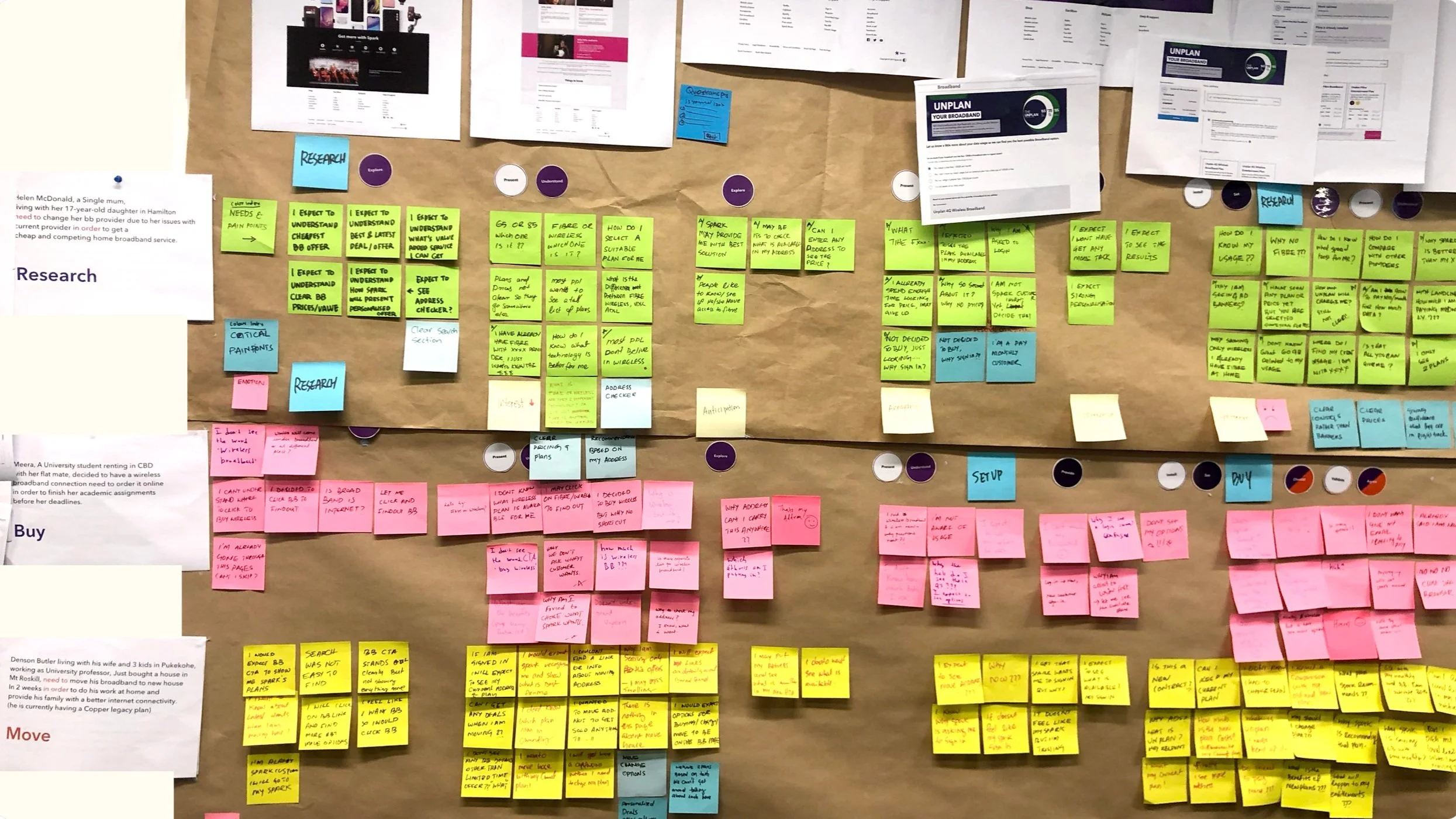
Identified Pain Points
In the last two months, 73,834 new customers started only 619 made it to the end.
Showing plans before verifying the address created confusion and frustration, as plan availability and pricing often changed after address verification
Irrelevant and poor grouping of information and choices made the pages too long and complex
Too many steps to understand the price and plans.
Ordering a new connection and moving house was in the same journey, making the overall experience complicated.
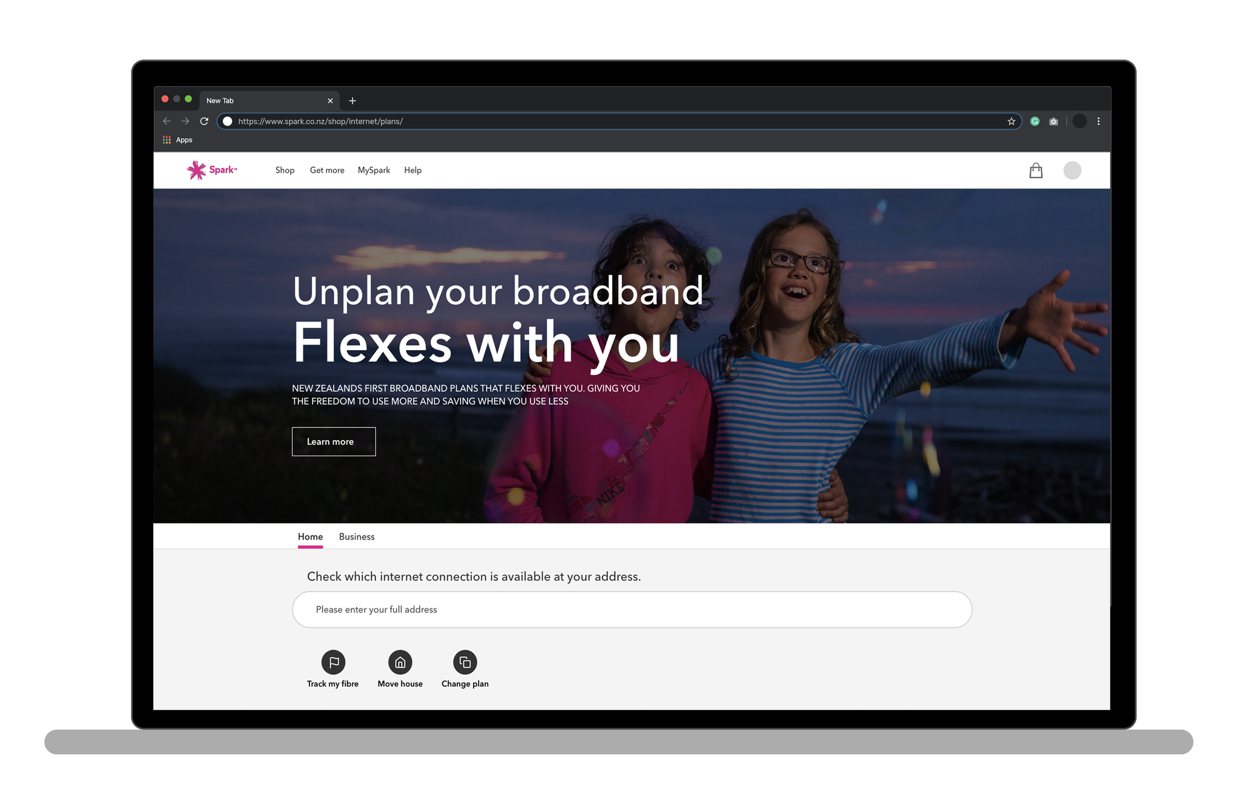
Unplan, a new Pay As You Use model, was unfamiliar to customers, who expected an Unlimited Plan and struggled to relate the terminology.
Other issues
Customers were looking for "unlimited" broadband or "high-speed fibre broadband" - a mismatch between customer expectations and the names of the plans on offer.
Business wants to push Wireless as the first choice and customers are unfamiliar with the technology details we were trying to communicate.
Not displaying price and technology details until sign-up or sign-in results in many drop-outs.
Define
Using Spark’s JUCCI framework—Join, Use, Change, Care, Involve—we mapped user needs and frustrations to each stage of the journey.
We prioritised the Join stage and put down the new guiding princples:
Clarity – Clearly show what’s available at the customer’s location to remove uncertainty.
Personalisation – Present and promote plans that are most relevant to each user.
Simplify – Streamline the journey to make plan selection effortless and intuitive
Reduce Choices – Limit visible options and progressively revealing add-ons or upgrades as needed.
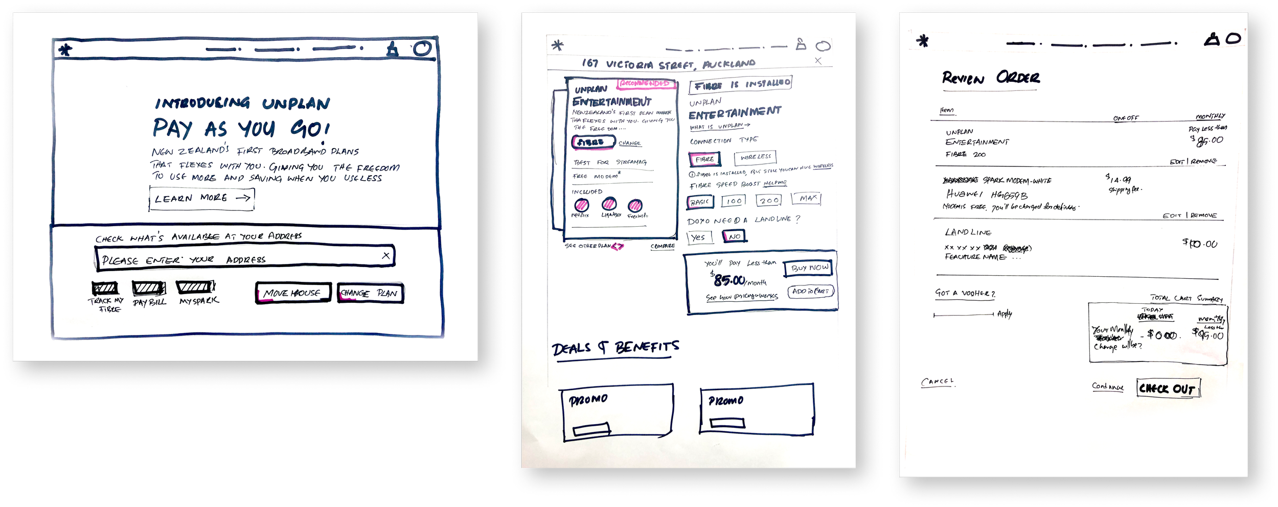
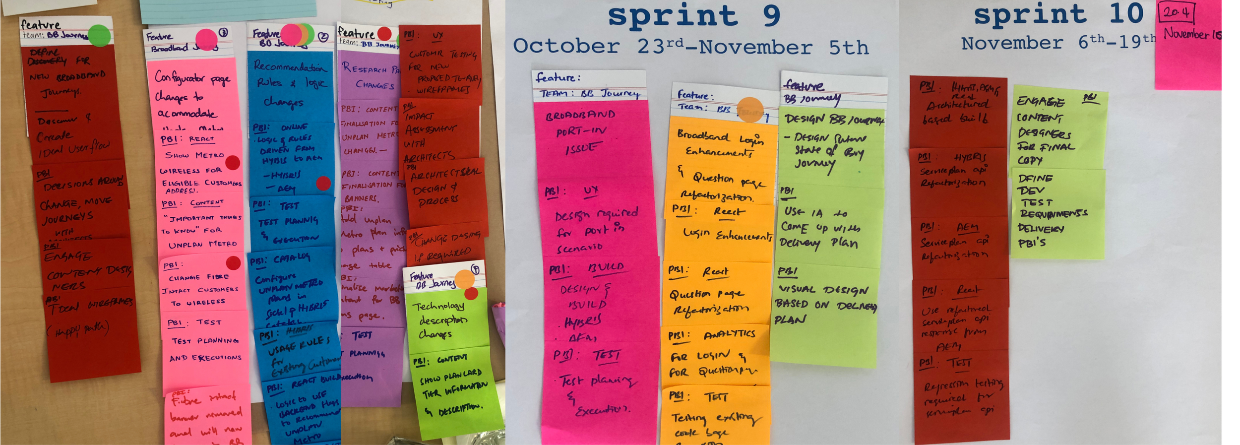
Simplifying the journey
Started drafting user flows and simplified the customer path,I separated the ‘Move house’ journey from the ‘new broadband connection’ journey.

Deliver
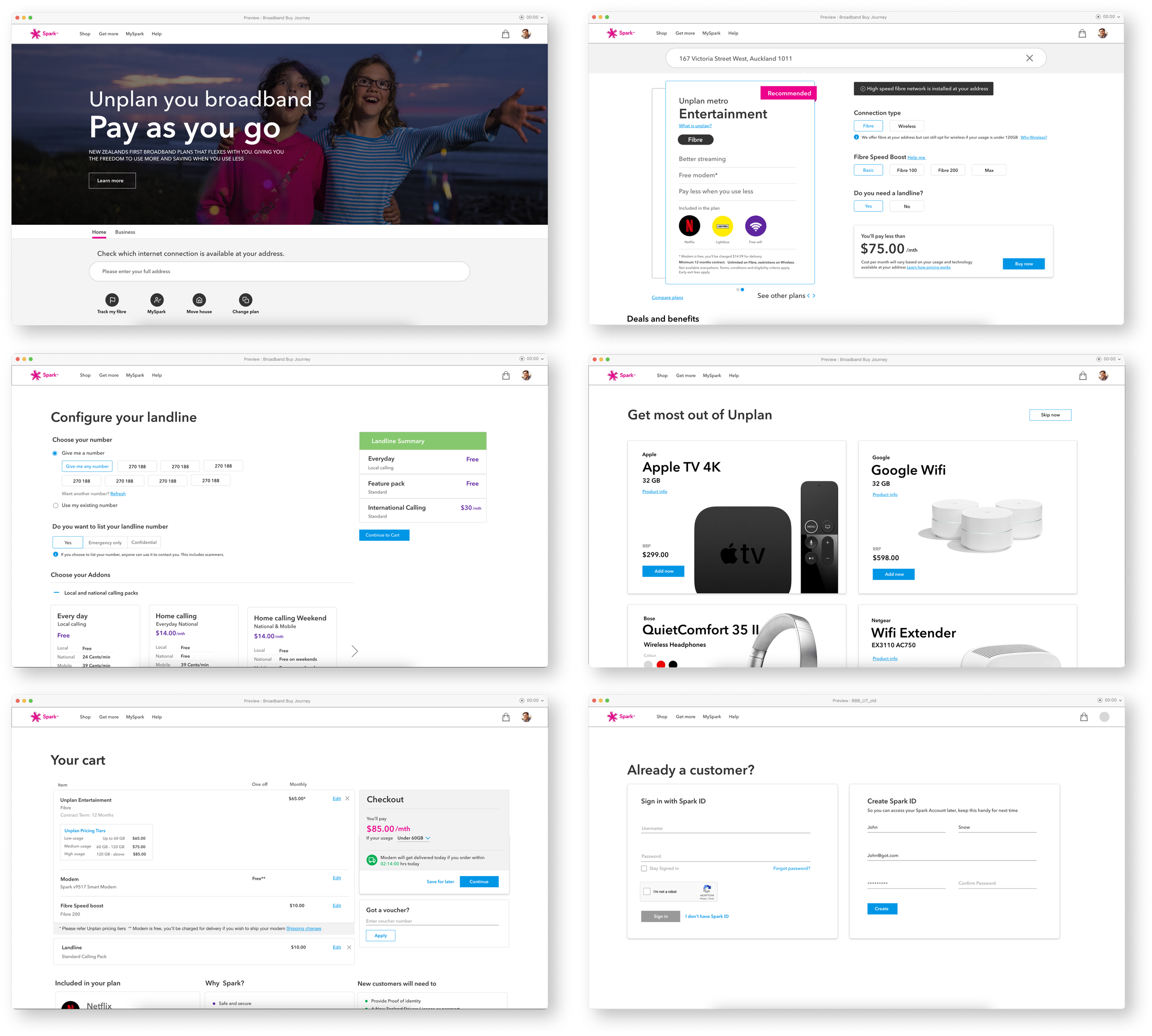
We prototyped and tested simplified experiences tailored to distinct user journeys:
Split paths early: Users selected whether they were new, moving house, or existing customers.
Address first: Moved address input to the start to show relevant plans only.
Content grouping: Reorganised steps into logical sections with visual clarity and helpful tooltips.
Plan transparency: Displayed upfront costs and contract terms more clearly.
We ran usability testing on interactive Figma prototypes with target users, capturing feedback and iterating on unclear steps.
Design decisions made
Split journeys based on intent
I redesigned the entry point by asking users if they were joining Spark, moving house, or changing plans. This helped create focused flows for each use case instead of forcing everyone through a single, complex journey.
Address first, then plans
I shifted the address input to the beginning so users only saw plans available at their location. This avoided confusion and disappointment later in the journey.
Simplified plan selection
I cleaned up the plan cards to show only what mattered—speed, data, contract, and price—paired with info icons to explain technical terms in plain language.
Step-by-step journey design
I introduced a clear, progressive screen-by-screen flow. Each step focused on a single action, improving usability and keeping users from feeling overwhelmed—especially on mobile.
Designed for edge cases
I accounted for tricky scenarios like unavailable addresses, wireless fallback, BYO modem options, and users switching paths mid-journey. I designed helpful error states and fallback logic for each.
Help user to make right decision
Instead of pushing technology decisions to the customer, we gave options based on usage, benefits and convenience.
Outcome
The redesigned experience aimed to:
Decrease abandonment by removing unnecessary friction.
Improve customer confidence by showing accurate plans upfront.
Increase digital conversion rates.
Free up contact centre capacity by reducing common queries.
While post-launch data was still being gathered, early feedback from internal teams and usability sessions showed a marked improvement in clarity and flow.
Learnings
This project reinforced the importance of:
Clarity over cleverness: Plan names and steps need to be obvious, not branded.
Early filtering: Understanding user intent early prevents unnecessary complexity.
Stakeholder alignment: Working across squads (billing, network, product) was key to cohesive changes.
Frameworks like JUCCI: Helped us frame the customer journey across service and product design, not just screen-by-screen.