
MySpark Business
B2B Platform Transformation:
50% Adoption Increase, 20% Support Cost Reduction
Research | UX | Journey map | User Testing
Project overview
I led the UX strategy to help Westpac comply with new financial regulations while maintaining customer trust and staff efficiency.
Company: Spark NZ (New Zealand's largest telecommunications provider)
Duration: Multi-phase project, 2+ Years
Role: Design Lead
Team: Embedded across 4 product squads
Impact at a glance
Business metrics
50% increase in B2B self-service adoption
20% reduction in call center volume (estimated $2-3M annual savings)
SUS score: 80+ for redesigned journeys (baseline was 45)
4 new customer segments unlocked through modular micro-portals
Organisational impact
Established "the wall" as journey mapping best practice across Spark Digital
Mentored 3 CX designers who joined project in later phases
Created modular React component patterns adopted by other Spark products
Won Best Team Player Award for cross-functional design leadership
I’ve delivered
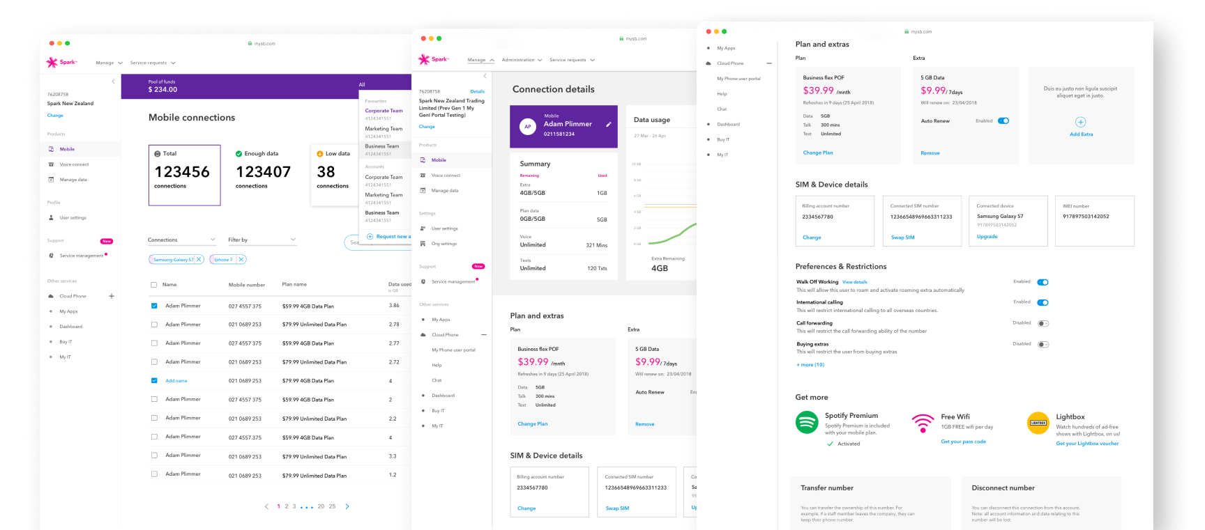
Portal design strategy based on Spark’s Pattern library
Login & user management redesign
Self-service password reset
Product (mobile, data, broadband etc) buy, add, change, cancel journeys
Service request removal & self-service transition
Billing transparency (usage + invoices)
Managed Data micro-portal for specialised customer segment
Micro-portal for Govt Customers
Change ownership journeys
The challenge
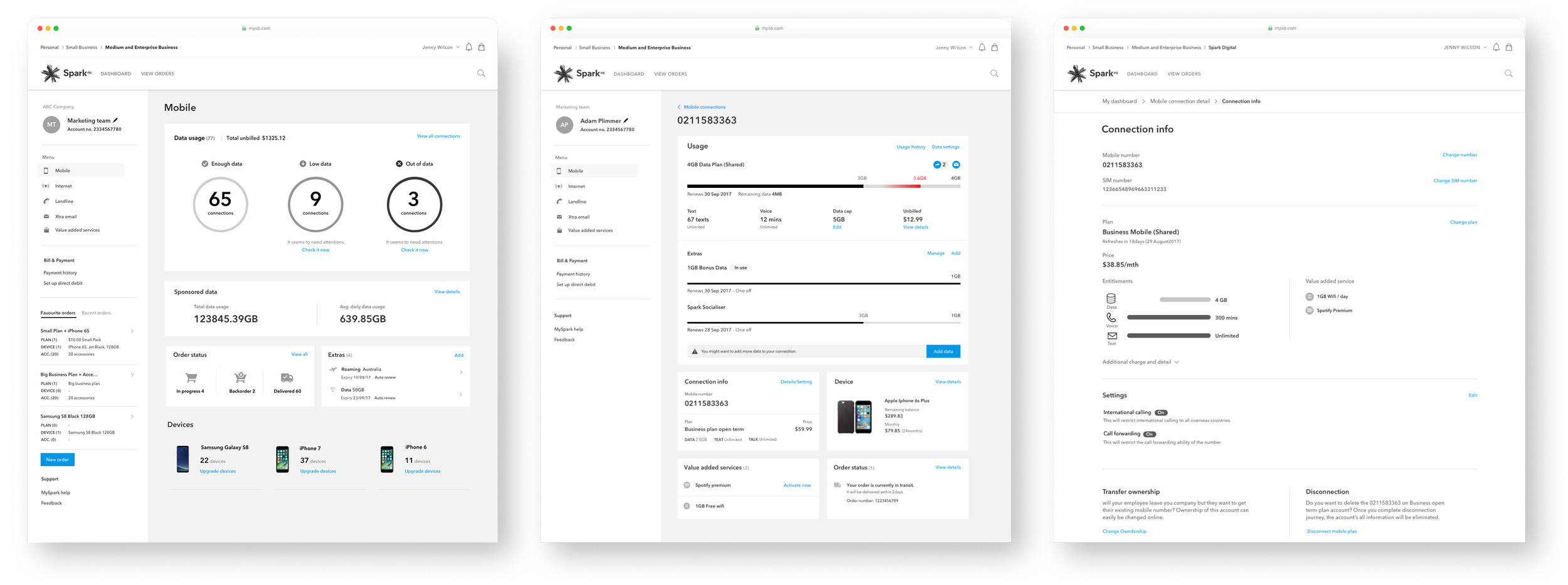
MySpark Business was Spark NZ's legacy B2B self-service portal for SME, enterprise, and government customers. It was outdated, fragmented, and driving massive support costs.
What was broken
Customer pain points
Forced to call support for basic tasks like password resets and user management
Navigation was fragmented, essential features buried 3+ clicks deep
Forms were inconsistent across mobile, broadband, and IoT products
Government and managed data customers had no digital path at all
Business pain points
Enterprise customers couldn't self-serve, creating support bottlenecks
Call centre costs were growing faster
Platform prevented scaling without proportionally scaling support teams
Customer satisfaction scores were declining
My role: Design Lead
I was the sole UX designer and Design Lead for MySpark Business, owning UX strategy across the B2B portfolio for over two yearsWhat I owned
UX Strategy:
Defined design direction, prioritisation, and phased rollout approach
Architected modular solution that delivered value incrementally on legacy platform
Research & Discovery:
Led customer research, staff interviews, and analytics analysis
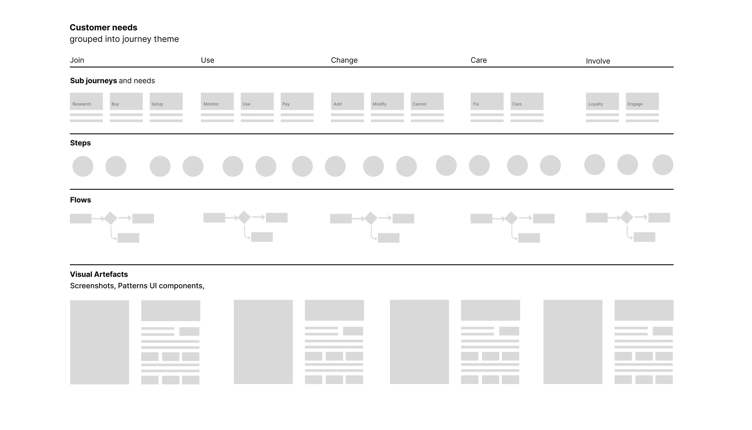
Created many journey maps using Spark's JUCCI framework
Built The wall, physical journey artefact that became alignment centrepiece
Design Execution:
Designed flows, prototypes, and specs for all major journeys
Created design patterns for Spark's component library
Defined micro-portal strategy for unsupported customer segments
Leadership:
Orchestrated 20+ stakeholders across tribe, billing, engineering, provisioning, product.
Facilitated workshops with teams who'd never worked with UX before, like Network engineers and Provisional teams
Mentored 3 junior designers Joined in the tribe
Team structure
Collaborators: CX Designer (journey mapping), engineers (React components), content designer (microcopy), researchers (validation)
Squads: Platform, Onboarding, Billing, CRM
Reported to: Head of Experience Design, Spark NZ
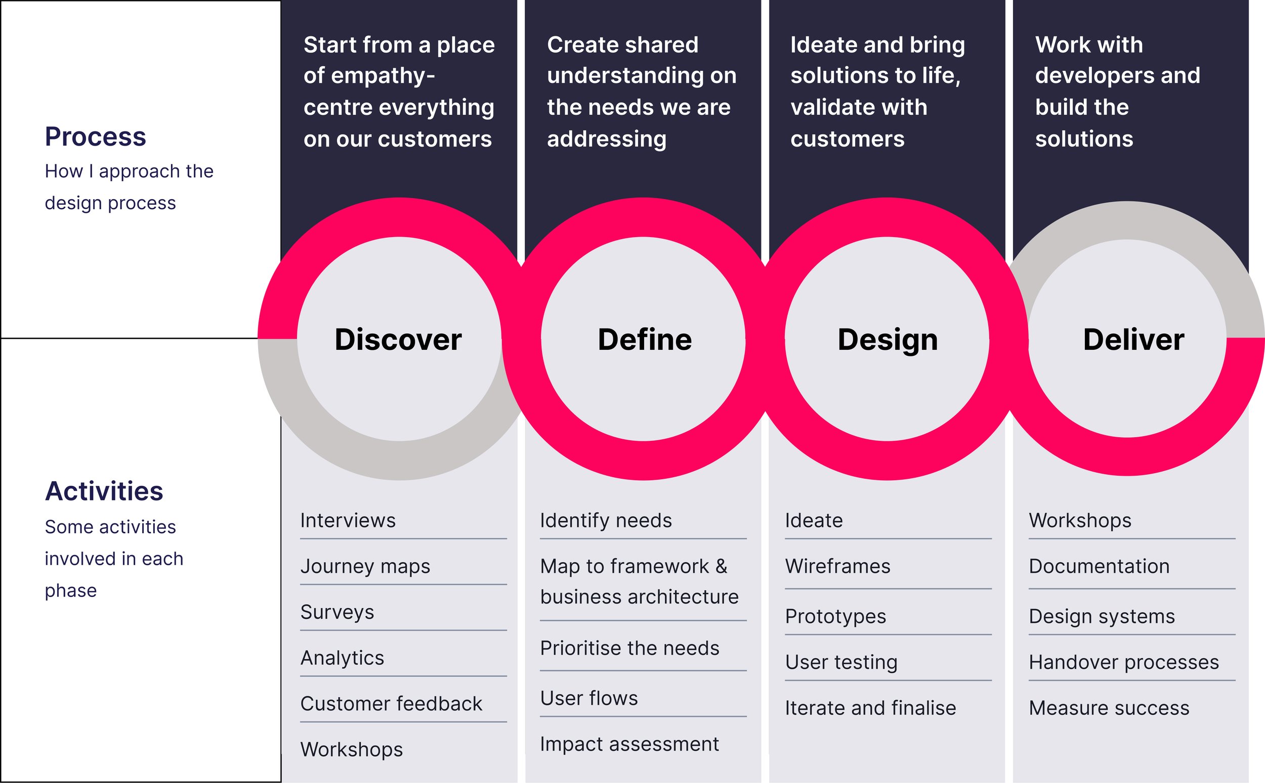
My strategic approach
Rather than wait 18 months for a greenfield rebuild, I architected a four-phase modular strategy that delivered value every quarter while working within legacy constraints.
Quick wins :
platform refresh
Simplified navigation, applied new brand identity, created visual consistency
Capability uplift of
self-service features
Enabled password reset, user management, usage visibility—removing support dependency
Core journey modernisation
Redesigned existing product ordering and account management flows
Modular portals for
new customer segments
Built React micro-portals for government and managed data customers
This approach let us improve the experience for existing customers immediately while unlocking new segments progressively.
Key design decisions
Making complexity visible - The Wall
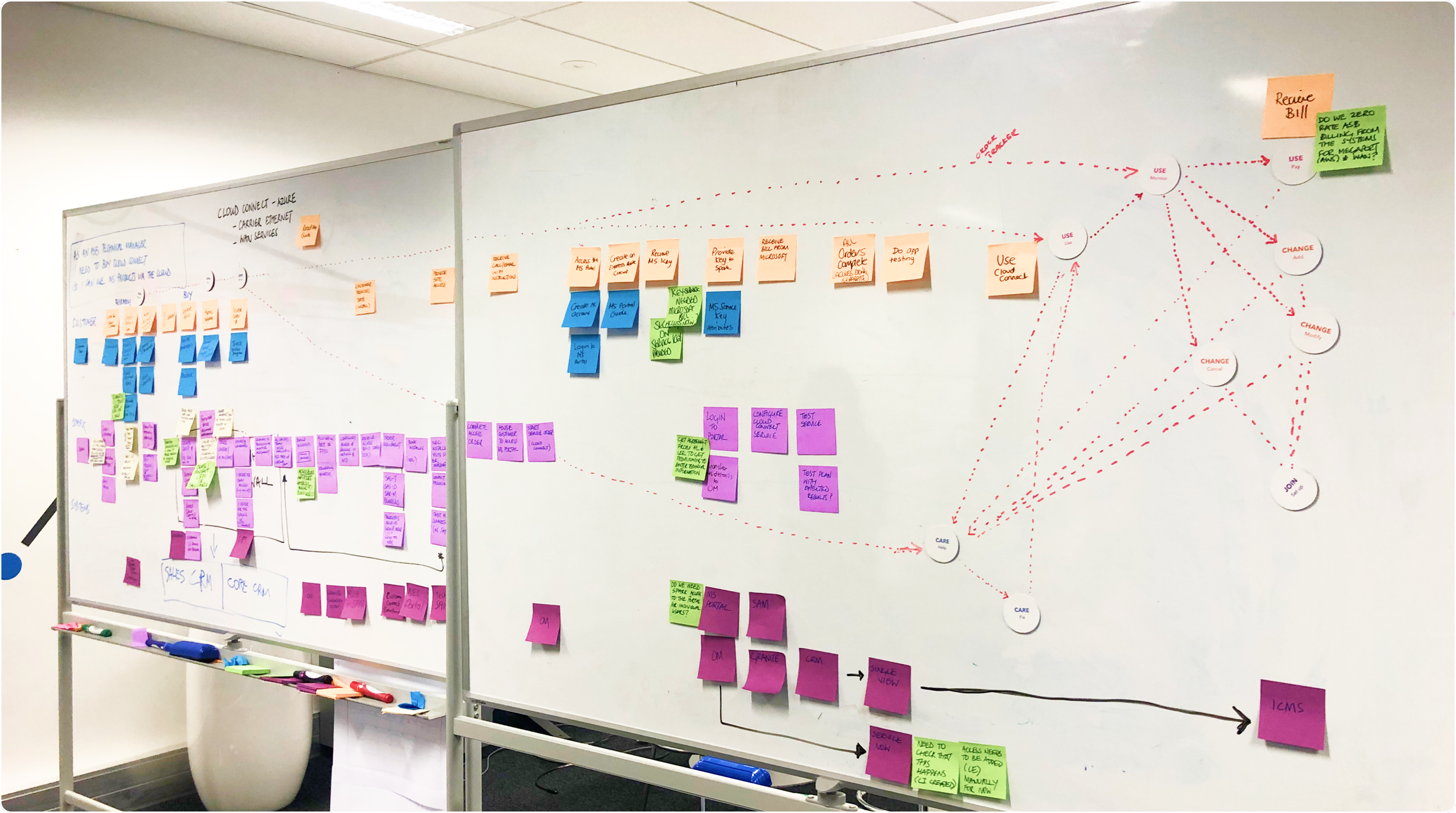
I've started an ambitious wall to build a display of artefacts, using Spark Digital's JUCCI framework as a guide. At the top, I listed the identified customer needs, followed by the core journey steps underneath, and then mapped out the key points to consider. After that, I placed detailed user flows and mapped the existing screens.
What I did:
I built a physical journey wall on the office floor using Spark's JUCCI framework, mapping customer needs, pain points, and touch points across the entire B2B lifecycle.
Why It worked:
The wall became a landmark. People from sales, billing, network engineering, and provisioning would stop by, ask questions, and contribute insights. It transformed abstract journeys into something tangible and discussable, accelerating cross-functional problem-solving.
Impact:
Displaying journey maps, user flows, and other visuals on the floor was incredibly helpful. People passing by would stop and look at the wall, leading to conversations about different aspects of the product, journeys, and solutions. I was always available to answer questions, share ideas, and post them on the wall, which gave me incredible insights and led to some great conversations.

Self-service capability
The Problem:
Analytics and research showed issue wasn't caused by ugly UI, it was caused by forced support interactions for things that should be self-service.
What I did:
I prioritised building functional capability
Password reset: Previously required calling support. I designed secure self-service flow using email/SMS verification.
User role management: Admins couldn't add/remove users without calling. I designed role assignment interfaces with clear permission explanations.
Usage monitoring: Customers had no visibility into data or call usage. I designed real-time dashboards integrated with billing.
Self service over Service request: Streamlined service requests by guiding customers to self-service options for supported products.
Why it worked:
These features addressed the root cause of support calls, not just symptoms.
Impact:
These three features alone accounted for 15% of the call center volume reduction. Customers who could self-serve were significantly more likely to complete other journeys end-to-end.
Workshops & stakeholder alignment


UCDC session with provisioning team mapping technical constraints & Journey mapping workshop with account managers and sales team
Bringing non-UX teams into the process
Many stakeholders—billing, provisioning, network engineering—had never worked with a UX designer before. I needed to build trust and shared language.
Workshops I Facilitated:
UCDC sessions with provisioning teams to map technical constraints
Journey mapping workshops with sales and account managers
Current vs. future state mapping with product and engineering
Ideation sessions with cross-functional squads
‘The Wall’ as alignment tool
Instead of presenting insights in decks, I used the wall as a conversation starter. Stakeholders would walk over, point at a pain point, and ask "What if we did this?" It turned alignment from formal reviews into ongoing, organic collaboration.
Impact:
Built relationships outside design, which accelerated approvals and reduced rework.
Modular new micro-portals for segments
The Problem:
Government customers and managed data clients had unique workflow needs that the legacy platform couldn't support. These were high-value segments with zero digital offering.
What I did:
Rather than force fitting the main portal with features, I designed standalone React micro-portals which will be responsive for mobile and modern code base
Managed data Self-service portal
MAAS (Mobile-as-a-Service): Enterprise mobile device management
CMN (Cloud-Managed Network): Network provisioning dashboard
PAPN Order Tracker: Government procurement workflows
ADS Queue for Staff
Government Portal: Custom flows for public sector compliance
These were embedded into the legacy site via iframes
Why it worked:
We could serve these segments without disrupting the core experience or requiring full platform releases.
Impact:
Unlocked 4 previously unsupported customer segments
Created template for future product launches
Enabled Spark to serve Government customers digitally for first time
The approach
Instead of focusing on what’s broken in the current portal, we focused on why customers contact us.
I identified the main call drivers, understood the features customers are actually asking for, and set aside the existing journeys entirely. From there, we redesigned the experience from scratch, based on research into new journeys, usability, and logic.
Discovery & Research
Customer Research
30+ interviews across SME, enterprise, and government customers
In-person usability testing at Spark’s UX Lab
Remote testing with regional business customers
Journey mapping workshops with account managers
Staff Research
Interviews with call centre, sales, network engineering, and provisioning teams
Heuristic review of the existing platform
Analysis of drop-off points and support ticket themes
Competitor benchmarking
Design execution
Journey Maps Depending on how much we know about the journey, I've used various methods to create current-state and future-state journey maps. These maps provide detailed insights into the customer's experience, highlighting frictions, pain points, and emotions.
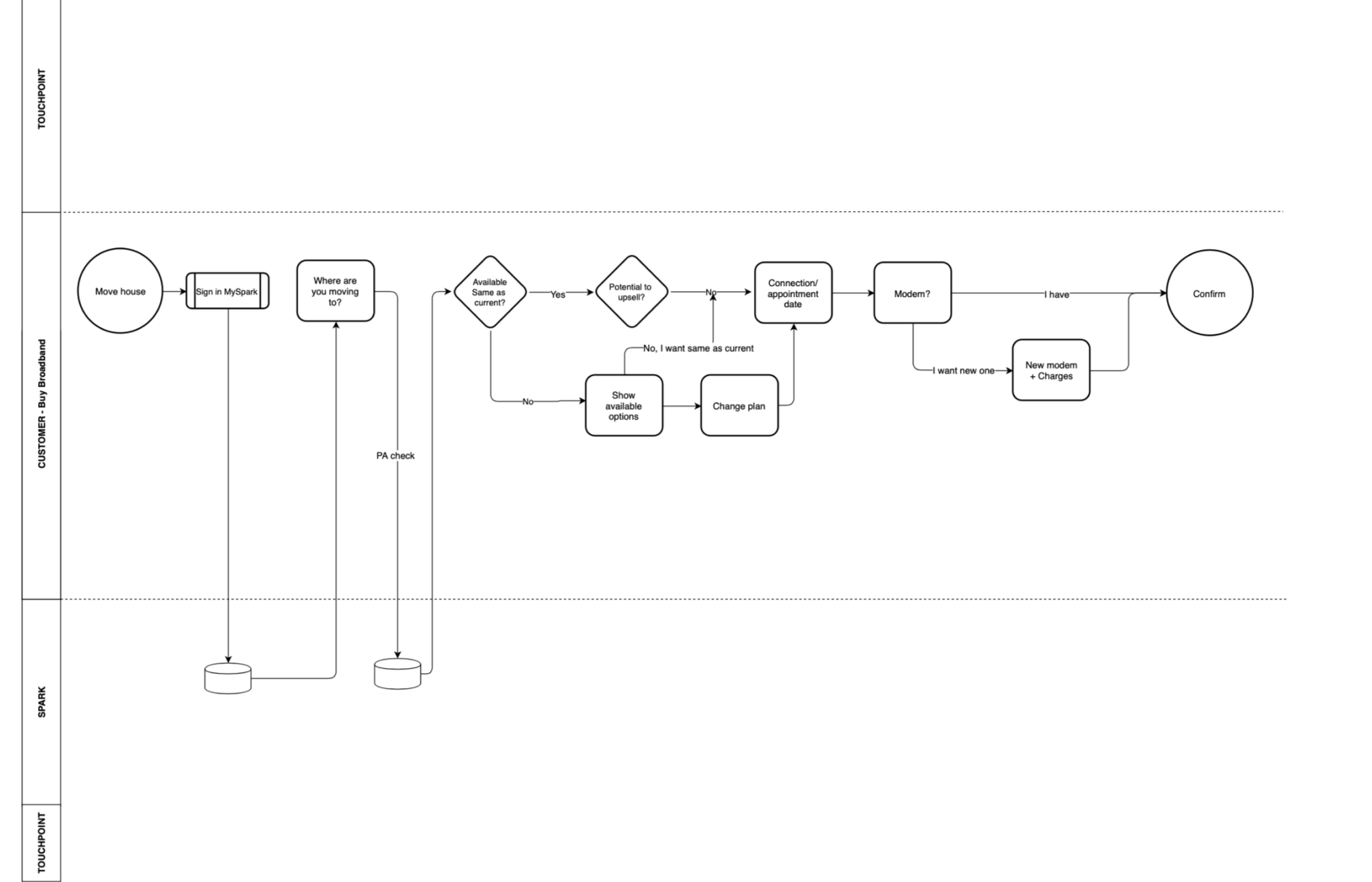
Userflows I always map out user paths to understand the different ways users interact with a product.
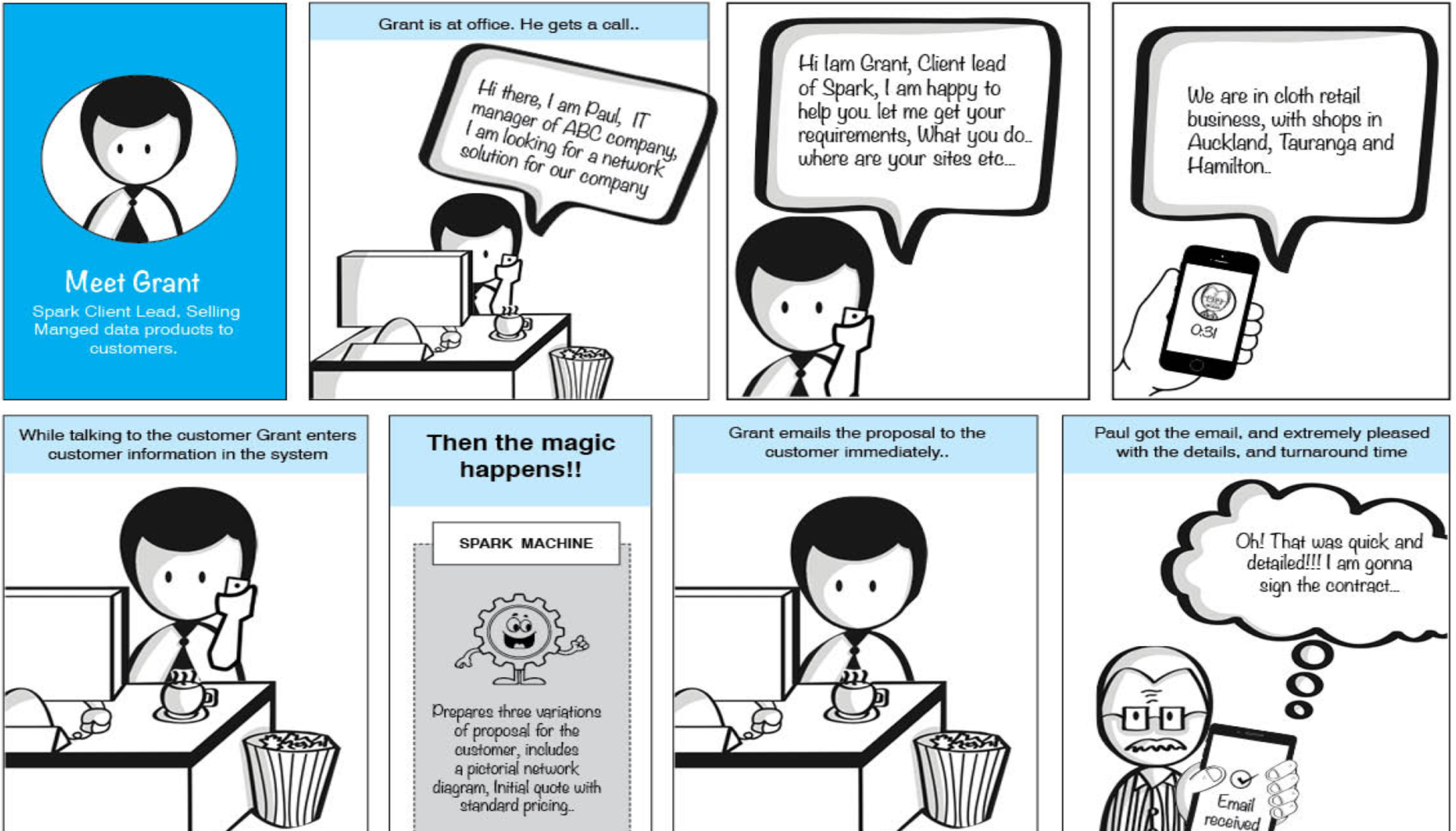
Storyboard is my go-to tool to communicate ideas effectively to the team
User flows & wireframes
I mapped user paths for every major journey:
New customers vs. existing customers
SME vs. enterprise vs. government workflows
Mobile vs. desktop contexts
Error states and edge cases
Tools: Draw.io, Lucidchart, Figma, Miro
Prototyping & testing
High-fidelity prototypes in Figma using Spark's design system
Interactive flows for testing (not static screens)
5+ rounds of iteration based on feedback
Handoff
Delivered specs via Zeplin with detailed annotations
Documented edge cases and error scenarios
Provided accessibility guidance (WCAG AA)
Conducted design QA during implementation sprint
Outcomes & impact
Business metrics
Self-Service adoption:
50% increase in customers completing journeys without support
SUS score: 80+ for redesigned journeys (up from ~45)
Operational Efficiency:
20% reduction in call center volume across B2B support
Estimated $2-3M annual savings in support costs
Faster onboarding for new enterprise customers
Revenue Impact:
Unlocked previously unsupported customer segments
Enabled B2B revenue scaling without proportional support team growth
Organisational impact
Design practice elevation:
"The wall" became best-practice journey mapping tool across Spark Digital
Mentored 3 junior designers into mid-level contributors
Created modular React patterns that became templates for other products
Cross-Functional Collaboration:
Built trust with engineering, provisioning, billing teams
Recognized with Best Team Player Award
Facilitated 12+ workshops that shifted stakeholder mindset from "build features" to "improve experiences"
Platform & System Improvements:
Delivered 10+ major journey redesigns
Launched 6 micro-portals serving niche segments
Contributed B2B-specific patterns to Spark's design system
Key Learnings
1. Stakeholder alignment is design work
Visual artifacts like journey maps and "the wall" created shared understanding faster than decks. When stakeholders can see and touch the customer journey, they engage differently—they ask better questions, contribute insights, and co-own solutions.
2. Don't wait for perfect tech
We unlocked significant value by working with constraints, not against them. Layering modern UX onto legacy systems through micro-portals and modular components delivered results 18 months faster than waiting for a full rebuild.
3. Self-Service is a mindset shift
We weren't just designing screens, we were changing how customers interacted with Spark and how internal teams thought about customer autonomy. This required education as much as execution for customers and internal teams.
4. Modular beats monolithic
Building micro-portals for edge cases allowed us to serve niche customer segments without bloating the core platform. This became a template for future product launches—enabling faster time-to-market and reducing risk.
What's Next
After I left Spark in 2020, the MySpark Business platform continued evolving based on the foundation we built:
The micro-portal strategy expanded to additional product lines
Design patterns I created were adopted across consumer-facing products
Personal Reflection:
This project taught me that design leadership isn't just about making things look good—it's about building the systems, practices, and relationships that enable great design at scale. The artifacts we created outlived the project because they solved real organizational problems, not just customer problems.
Related Work
Next: DCS — Strategic design and research for regulatory compliance →
Also See: Business Lending Modernization →